Flu Analysis - Model Fitting

Author

Aidan Troha

We begin by using the library function to be able to use the tidymodels packages

library(tidymodels)
── Attaching packages ────────────────────────────────────── tidymodels 1.0.0 ──
✔ broom        1.0.3     ✔ recipes      1.0.5
✔ dials        1.1.0     ✔ rsample      1.1.1
✔ dplyr        1.1.0     ✔ tibble       3.1.8
✔ ggplot2      3.4.1     ✔ tidyr        1.2.1
✔ infer        1.0.4     ✔ tune         1.0.1
✔ modeldata    1.1.0     ✔ workflows    1.1.3
✔ parsnip      1.0.4     ✔ workflowsets 1.0.0
✔ purrr        0.3.4     ✔ yardstick    1.1.0
── Conflicts ───────────────────────────────────────── tidymodels_conflicts() ──
✖ purrr::discard() masks scales::discard()
✖ dplyr::filter()  masks stats::filter()
✖ dplyr::lag()     masks stats::lag()
✖ recipes::step()  masks stats::step()
• Use tidymodels_prefer() to resolve common conflicts.

We must also ensure that the data set we previously cleaned carries over to this segment of the analysis.

fludat_clean <- here::here("fluanalysis","data","processed_data","flu_processed")
flu_clean <- readRDS(fludat_clean)

We can create the general models we will use by setting the engine with set_engine() for linear and logistic regression, repsectively.

linear <- linear_reg() %>%
              set_engine("lm")
logit <- logistic_reg() %>%
              set_engine("glm")

Linear Regression

Restrictive Model

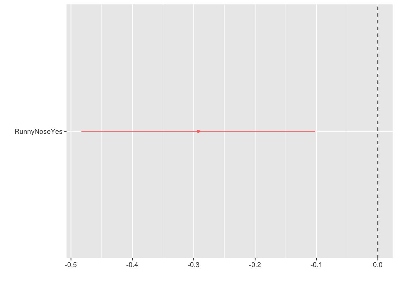
We first fit the model predicting temperature from having a runny nose:

lm_fit1 <- linear %>%
            fit(BodyTemp~RunnyNose,data=flu_clean)
# By using the tidy function, we can convert the resulting list into an easy to read table
# From there, we can also create a dot and whisker plot to demonstrate the relative size
# of the estimates
broom::tidy(lm_fit1) %>%
      dotwhisker::dwplot(vline = 
# Creates a vertical line to visualize no association
                           geom_vline(xintercept = 0, 
                                      colour = "black", 
                                      linetype = 2))

We see that the regression coefficient relating runny nose status and body temperature is about -0.3. ### Other Models No we will see how this compares to a less restrictive model by using more predictors:

lm_fit2 <- linear %>%
            fit(BodyTemp~RunnyNose * ChillsSweats * Fatigue * Weakness,
                data=flu_clean)
broom::tidy(lm_fit2) %>%
      dotwhisker::dwplot(vline = 
                           geom_vline(xintercept = 0, 
                                      colour = "black", 
                                      linetype = 2))

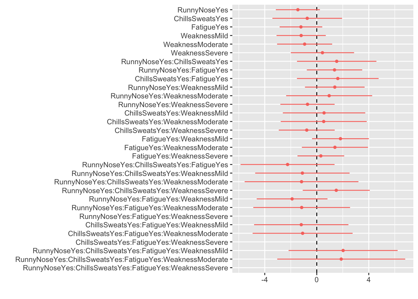
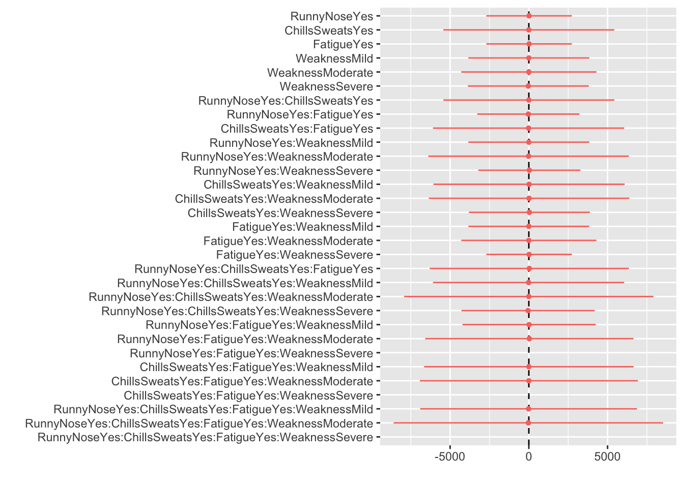
Using 3 more predictors for body temperature, we get 32 different coefficients relating body temperature to each prediction and their associated interactions. We can see that this model may be too complex for interpretation.

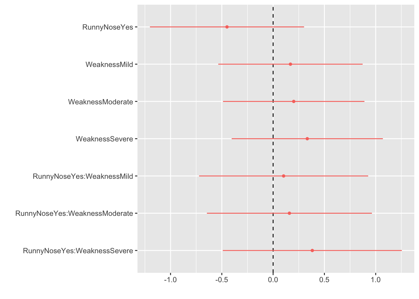
Instead, we may want to look at how 2 or 3 predictors could impact the results:

lm_fit2 <- linear %>%
            fit(BodyTemp~RunnyNose * Weakness,
                data=flu_clean)
broom::tidy(lm_fit2) %>%
      dotwhisker::dwplot(vline = 
                           geom_vline(xintercept = 0, 
                                      colour = "black", 
                                      linetype = 2))

This model is easier to use and make predictions from but is still less restrictive than the original model.

Logistic Regression

Restrictive Model

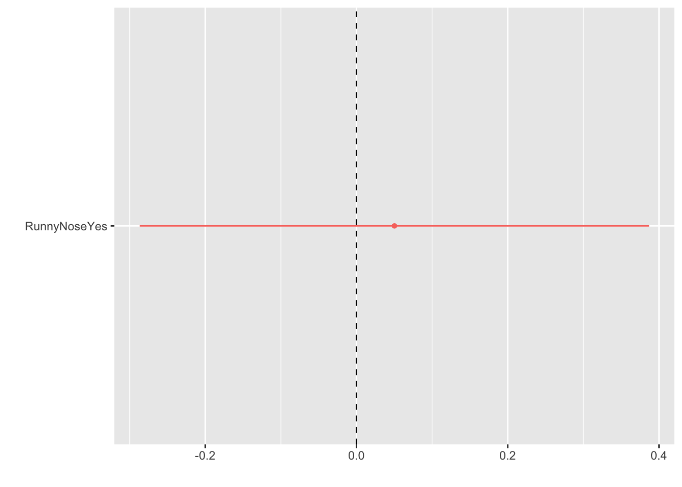
We first fit the model predicting nausea from having a runny nose:

log_fit1 <- logit %>%
            fit(Nausea~RunnyNose, data=flu_clean)
# By using the tidy function, we can convert the resulting list into an easy to read table
# From there, we can also create a dot and whisker plot to demonstrate the relative size
# of the estimates
broom::tidy(log_fit1) %>%
      dotwhisker::dwplot(vline = 
# Creates a vertical line to visualize no association
                           geom_vline(xintercept = 0, 
                                      colour = "black", 
                                      linetype = 2))

We see that the regression coefficient relating runny nose status and nausea is depicted above with it’s 95% CI. The coefficient estimate is about 0.05.

Other Models

Now let’s fit a less restrictive model:

log_fit2 <- logit %>%
            fit(Nausea~RunnyNose * ChillsSweats * Fatigue * Weakness, data=flu_clean)
broom::tidy(log_fit2) %>%
      dotwhisker::dwplot(vline = 
                           geom_vline(xintercept = 0, 
                                      colour = "black", 
                                      linetype = 2))

We see that, again, the model is too crowded for much meaningful interpretation. We do notice the much wider ranges of values obtained by the model. Likely, the effect size is so diluted by the vast number of predictors used in the model. If more predictors are introduced, the ranges of values will also increase exponentially larger.

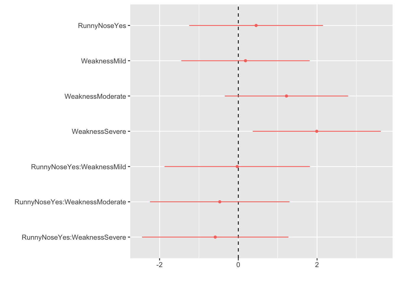
Instead, let’s try looking at something a little simpler but still less restrictive than the original model:

log_fit2 <- logit %>%
            fit(Nausea~RunnyNose * Weakness, data=flu_clean)
broom::tidy(log_fit2) %>%
      dotwhisker::dwplot(vline = 
                           geom_vline(xintercept = 0, 
                                      colour = "black", 
                                      linetype = 2))

Here, we can see relative effect that each predictor has on the outcome. Simply, we see that severe weakness is strongly associated with increased nausea.